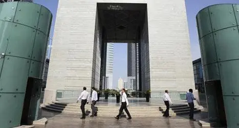
The people of Kuwait saw the first appearance of the new MTC-Vodafone brand at a number of MTC stores and at the head office buildings in Kuwait.
Kuwait: Sunday, March 09 - 2003. The distinctive new logo of MTC will sit above the red of Vodafone within a SIM card emblem.
Commenting on the change to the MTC logo, Dr Saad Al Barrak, Director General for MTC-Vodafone, 'The MTC Board made the decision to bring the two logos together as part of our partnership agreement with Vodafone. By being linked to a leading, world class operator such as Vodafone, MTC will be able to gain more as a business than without such a connection.'
'As a business we know that communications, and communicating, is driven by people. In the telecom sector, companies wishing to really service and retain their customers have to also hear and understand their customer. Our new advertising will also carry the strap line: 'MTC-Vodafone. We hear you.' We are committed to providing services our customers say they really want.'
The change of branding also comes in response to MTC's long term view that telecommunications as a whole is a very dynamic sector; however within the Middle East it is posed to change more radically than elsewhere. The Board has considered these changes; seen numerous opportunities for regional expansion, and sees that MTC needs to be more widely recognized within the Middle East and further a field in the international market. Therefore MTC - the Voice of Kuwait - has to change to keep apace of the telecom sector.
Dr Saad went on to comment, 'One of our key partnerships (Vodafone) is significant in supporting MTC's ambitions to be more than just a 'local' company. However, to ensure MTC maximizes its relationship with Vodafone and has the ability to stand on its own in the international market, the Board agreed that the MTC 'brand' had to be developed to reflect the new challenges ahead. We believe the new logo also reflects the new nature of the company and the characteristics of our current and future partnerships.'
'However we recognized that changing our logo would be a big step and wanted to make sure our customers were happy with the change we were about to make. In research our customers highlighted what really attracted them to MTC; what parts of our original logo they were most comfortable with; and what they would miss most if the logo were to change.'
'In response to our customers comments, we have retained the corporate BLUE; dispensed with the outdated hexagon outline and introduced a more international feel with a circular, 'global' symbol. 'MTC' as an acronym was modernized through the use of lower case and an emphasis was placed on the 'm' signifying 'mobile'.
We have also retained the communication tower, which sits within a pale blue color and shows communication waves radiating from it. The pale blue semi-circle reflects our Kuwait history and could also be interpreted as a sail from a Dhow. The darker blue lines radiating from the pale blue semi-circle also signifies our ambitions for growth outside of Kuwait.
The sim card frame, within which the logo sits, also reflects our GSM service and potential for 3G. By bringing the two logos (Vodafone and the new MTC) together within the sim card frame we believe this stresses potential growth; provides international recognition and reliable; international services for our customers.
We are confident that by keeping the darker blue color that we will retain the market awareness that MTC is the No 1 mobile operator in Kuwait; and customers will continue to identify with, plus draw comfort from, the strength of the color but also recognize the use of a lighter blue as a new fresh and dynamic approach.'
'The strap line to our advertising says: 'MTC-Vodafone. We hear you.' We have held some 35 customer and staff focus groups to ensure that we really do hear what our customers have to say and also ensure that we service and retain these customers by understanding their needs and satisfying their aspirations.'
'We have completely overhauled our 107 customer service department by improving response times and product knowledge. There has been heavy investment in state of the art technologies through the investment of a new portal website (www.mtc-vodafone.com) which will in time be fully interactive and user friendly providing a whole host of services such as the ability to pay on line, query billing, managing your own account and changing service packages when it suits you.'
The change of the logo is effective from March 1st, 2003 and coincides with a major advertising campaign to highlight the new brand to customers, staff, partners and distributors. Five of the MTC retail stores will show the new branding immediately with all the other stores changing over a period of time. The logo on both head office buildings and on various advertising hoardings will also change immediately.
-Ends-
© Press Release 2005