Forty years ago, Advertising Age published a series of articles by Jack Trout and my father, Al Ries, titled The Positioning Era Cometh.
Almost a decade later, McGraw-Hill published their book Positioning: The Battle for Your Mind. In the years that followed, "positioning" became one of the most talked-about concepts in the marketing community. In its 75th anniversary edition, Ad Age selected positioning as one of its 75 "top ad moments". More than 1.4 million copies of the book have been sold in 20 different languages, including 400,000 copies in China. But as revolutionary as positioning was, it had a weakness. Invariably, positioning strategy was expressed verbally. You looked for a verbal hole in the mind and then you filled that hole with your brand name. But the best way into the mind is with visuals, not with words. Visuals play a more important role in marketing because they hold emotional power that sticks.
In 1973, for example, psychology professor Lionel Standing conducted a research study in which he asked subjects to look at 10,000 images over a five-day period.
The images were presented for just five seconds each. When the subjects were shown pairs of images (one they had seen before and one they had not), they remembered 70% of the images they had seen before. I challenge you to try presenting 10,000 advertising slogans for five seconds each and see how many of them a person will remember five days later. Now, here's a visual everyone can identify: a pink ribbon. Consider what the symbol has done for Nancy Brinker who in 1982 started a foundation to fight breast cancer in memory of her sister, Susan G Komen. Since then, the foundation has raised nearly $2 billion (QR7.3 billion). Today, Susan G Komen for the Cure is the world's-largest nonprofit source of money to combat breast cancer.
In contrast, the American Cancer Society was founded in 1913, yet most people have no idea what visual symbol the society uses. The Cancer Society has a trademark that is almost impossible to verbalise, while Susan G Komen has a visual that is easy to describe. I call Komen's pink ribbon its visual hammer because the interplay between words and images is like a nail and a hammer. A strong verbal idea is a brand's nail, but the hammer that really drives home the idea is the visual. This concept is even more important in today's global economy, where a strong visual hammer can cross borders without requiring translation.
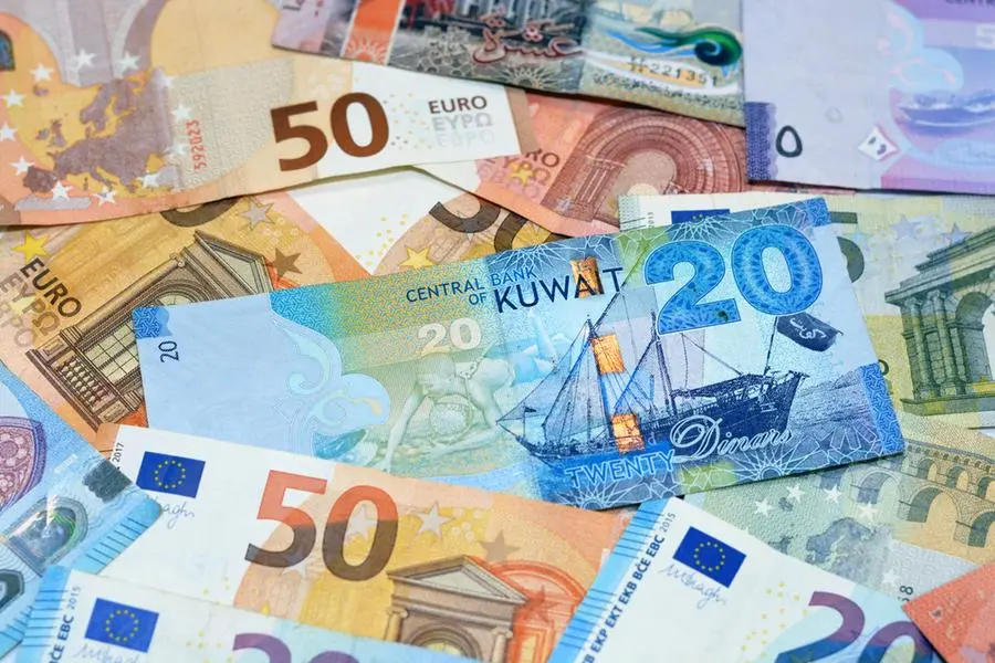
In 2010, Coca-Cola spent $267 million (QR972 million) advertising its brand in the US. What was Coke's slogan? Most people don't remember. What they do remember is the "contour" bottle.
The contour bottle is not just a package but a visual hammer that emphasises the idea that Coke is the original, the real thing. Even though Coca-Cola sells very little product in contour bottles, the visual is strongly identified with the brand. And the company reinforces the visual hammer effect by using the bottle image on its cans, cups, billboards, trucks and even business cards.
If Coke's contour bottle says "the authentic cola," what does Pepsi's "smiley-face" trademark, introduced to much fanfare in 2008, say? Pepsi's smiley face says "Pepsi". In essence, it's a rebus - a visual symbol that's a substitute for a brand name. PepsiCo's management, like many others, seems to think that a visual hammer is nothing but a glorified name for a trademark. That's why executives tend to spend a lot of time and money perfecting their trademarks rather than searching for visual hammers. In fact, almost all trademarks are rebuses. After years of constant use, they can be recognised as symbols that stand for brand names. But trademarks don't have to be meaningless.
Nike, for example, has the "swoosh", a powerful visual hammer, which doesn't just say "Nike", but "leadership". Nike was first in its category, giving it permission to create a visual hammer out of a rather mundane checkmark that has been streamlined. Today, everybody knows what a swoosh looks like, but how many people can rattle off a description of Reebok's trademark? The advertising industry is hung up on trademarks and logotypes, but in reality they account for only a small percentage of visual hammers. Anything associated with a brand can become a hammer. Colour, packaging, demonstrations, founders or celebrities. Even the product itself. Colour often plays a role in creating memorable visual hammers. Think: Tiffany's blue box, the US Masters green jacket, Nexium's purple pill and Christian Louboutin's red soles. The product itself can play that part: a Rolex watchband, the grille of a Rolls-Royce, the Absolut bottle or the polo player on a Ralph Lauren shirt.
Symbols can act as hammers to visualise "invisible" products: Travellers' red umbrella, Wells Fargo's stagecoach and Geico's gecko. And, finally, company founders can do this as well - think Colonel Sanders, Papa John, Frank Perdue, Orville Redenbacher and Paul Newman. McDonald's is another leading brand with a visual hammer. By naming its symbol, "the golden arches", the company moved beyond the rebus idea and turned the "M" into an effective visual hammer.
Not every brand gets it right. Despite $5.1 billion (QR18.6 billion) in annual sales, Red Bull doesn't own a visual hammer. The energy-drink brand had the opportunity, but its visual is too complicated for a small can. Two bulls and a sun make a weak hammer. Furthermore, its blue cans undermine the Red Bull name.
In spite of these examples, why do many marketing people work exclusively with words, when the real power is with visuals? Don't get me wrong, the objective of a marketing programme is to "own a word in the mind" and visuals shouldn't come before some well-thought positioning planning. But to consider words independent of how they might relate to a visual would be a mistake. BMW, for example, owns "driving", an achievement that turned the brand into the world's largest-selling luxury vehicle. The visual hammer that etched "driving" into the minds of BMW fans were its distinctive TV commercials showing happy owners maneuvering BMWs over winding roads.
In 2009, BMW switched its focus to "joy" - a verbal concept that broadens the appeal of the BMW brand. But how do you visualise it? Like many other high-level abstract words (happiness, enthusiasm, customer satisfaction, quality) joy cannot be visualised in any meaningful way. Is it a coincidence that for nine years in a row, from 2001 to 2009, BMW led archrival Mercedes-Benz in the US market and then, in 2010, after launching the joy campaign, fell behind Mercedes? Luckily, this year BMW ditched joy to go back its driving nail. Of course, advertising is loaded with visuals, but most of them never become hammers. They might be funny but if they're not also functional they do little for the brand.
Visual consistency is even more important than verbal consistency. You can sometimes successfully change a verbal nail, but not a well-established visual hammer. Look at what happened when Tropicana tried to drop its straw-in-the-orange image.
For decades, marketers have sat in meetings developing positioning statements for their brands. But sorry Dad, today that's not enough. Today, marketers also need a visual hammer to build their brands - one that connects emotionally, authentically and credibly with consumers.
© Qatar Today 2013