27 September 2013
BEIRUT: Some people take years learning the intricacies of the Arabic script, at times so ornate it can be difficult to decipher. Others are dedicated to designing a simple Arabic font that can be read at quick glance.
Both are vital for a script that is steeped in tradition while also quickly evolving as a modern marketing and reading tool.
“I try to build bridges,” says Nadine Chahine, whose work as a typographer has given her the opportunity to be a link between classical Arabic script and a more modern font that keeps the language alive and evolving.
So far, she has designed around 60 scripts, some for prominent projects such as signs at the Dubai airport, the MBC Action channel and for the redesign for An-Nahar newspaper two years ago.
While Latin script evolved to include a huge number of fonts over the past three decades, Arabic has been almost stagnant despite its rich tradition of varied designs, leaving many in the region to resort to using English or unrefined Arabic scripts. It is only now starting to catching up.
Today, there is a growing school of Arabic type design and calligraphy dedicated to the preservation and development of the script, with many young designers being inspired by the language’s rich heritage.
Legendary Apple founder Steve Jobs has often told the story that he stumbled upon his career path after taking a calligraphy class in college. In a similar vein, Pascal Zoghbi, a type designer known for his calligraphy and typography blog 29 Letters, says he was first inspired to go into his field because of an Arabic literature class he took at university taught by renowned philosopher and poet Said Akl.
An early pioneer in modern Arabic script design, Akl created a font based on the Phoenician alphabet in the 1950s.
“He spoke really passionately about Arabic. He made me want to learn more about Arabic script,” recalls Zoghbi, who now has 20 Arabic fonts to his name.
“Once you have designers who have good fonts to work with, then they will be happier using Arabic in their designs.”
Ironically, it is this love of the tradition of Arabic that prompts many to go into the business of modern font design.
“The best and only way to preserve the old styles in this modern age is to keep our own culture a priority,” says Nisreen Sarkis, senior designer at Wondereight branding agency.
“The Arabic script is like a treasure in its complexity, and anyone who wants to go into modernizing it needs to know its history beforehand.”
It wasn’t that long ago that there was almost no variety in Arabic font – even 10 years ago there were only two choices available.
Today, there are around 100 styles to choose from – although Arabic still has a way to go before it reaches the level of sophistication and variety of its Latin counterpart.
“On a more micro level, typography doesn’t only communicate a written message but also a personality and an opinion,” Sarkis says.
“Lots of experimentation has been done on Latin typography to encompass a huge array of feelings and shapes, while the Arabic typography is still undergoing this exploration.”
She also notes that with most of the Arabic work at Wondereight focused on creating Arabic logos of existing brands, it is important to not simply make an Arabic replica of its Latin (usually English) counterpart.
“This is a very delicate procedure since we are very keen on preserving the identity of the Arabic typography and not losing it at the expense of making it look similar to the Latin one,” Sarkis says.
“The decision to give these brands a local dialect came as a result of the need to preserve the Lebanese culture and its love of jokes, puns and traditional proverbs. The wide range of existing fonts and styles made it much easier for us to find the right voice for Dunlop: bold and safe and fast, and Hoover: homey and modern and chic.”
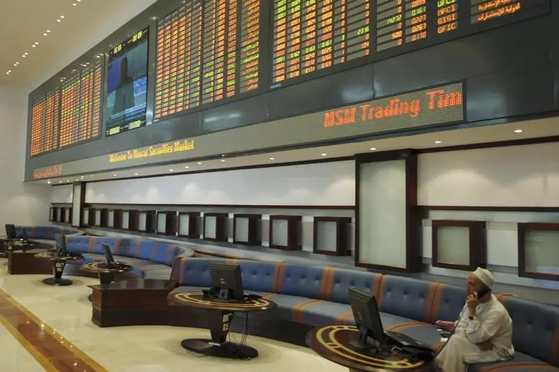
The main challenges for the Arabic font are: the complexity of word shapes, which can cause technical and legibility difficulties; curvy letters that can appear pixelated when in low resolution; very few books, references or places to study Arabic type design; and the digital piracy of fonts in the region, which discourages people from pursuing a career in type design.
Until recently, the placement of the short vowels (tashkeel) had also been a problem, but it has now been resolved through more advanced design and technology.
With these letters now getting their due attention, Arabic speakers are becoming better equipped to use their own language.
Though subtle, the role of Arabic font is crucial – especially in today’s fast-paced world where consumers are inundated with different messages from a variety of sources in different forms.
A good or bad font can mean the difference between whether someone reads a shop sign or walks past it, notices a product or not, and, most importantly, finishes a lengthy text or stops after just a few words.
A clear font, says typographer Chahine, “is like driving on a road without bumps” – it should only be noticeable when something is wrong.
She believes that more simple and engaging fonts can help increase reading rates in the Arab world, which, according to the annual Arabic Report for Cultural Development, is six pages per year. The same report found an Arab child on average reads six minutes per year compared with 12,000 for their Western counterparts.
“Anything we can do to change that is a step in the right direction,” Chahine says. “It’s not the main reason [for illiteracy and low reading rates], but it’s a contributing factor.”
She adds: “As a designer it’s the only thing to do to make it easier. People can get a headache while reading. If we present it in a way that’s more pleasing, it makes you want to explore. People feel it on a subconscious level.”
She recalls one instance in which a newspaper in the Netherlands changed their font as part of their redesign. Readers complained that they couldn’t read it, but didn’t know why.
“People notice that there’s something off, if it’s done badly,” she says.
For children, she believes, the problem can be even worse if they are introduced to an unpleasant script as they’re learning to read.
“When you’re looking at children’s books, you need to present information in an easy-to-understand and easy-to-read way. It removes barriers that the child might encounter.”
On the other hand, she would never dream of letting go of the ornate Arabic calligraphy that has inspired new generations of young font designers such as her. “There are different functions. We need both. We need to create a visual culture that’s rich and varied,” she says.
“It’s about who we are and what we are as a modern Arab generation.”
Copyright The Daily Star 2013.